Showing posts with label Twitter. Show all posts

Tuesday, August 9, 2011

#UKRiots on Google Maps - Updated

The Guardian UK Riots Map


The London Riots Map is no longer being updated. However The Guardian has stepped into the gap with this Google Map.


The latest incidents are displayed with red markers. The Guardian has also created a Google Map of reader's photographs of the riots.


London Riots - Verified Areas


This Google My Map is attempting to map verified locations that have been affected by the London rioting and looting.


The map is showing locations that have been reported in the mainstream media. You can tweet @jamescridland if you have information from a verifiable source of an area affected.


MapTube Map


Someone has taken the KML from the London Riots - Verified Areas map and displayed it on Map Tube with the Index of Multiple Deprivation (IMD). The IMD is a method of identifying deprived areas across the UK.


Overlaying the locations of the riots and looting on top of the IMD layer reveals that most of the trouble is occurring more in areas with high deprivation than in more affluent locations.


London Riots Map


As London enters its third night of rioting someone has released a London Riots Map, loosely based on Ben Marsh's #UKSnow map.


The mainstream news networks in the UK have been quick to blame social network sites and BlackBerry phones for providing a medium for rioters to organise their looting and attacks on the police. The London Riots Map however clearly provides just another way to report news of the rioting, with the added advantage of being crowdsourced and almost real-time.


The map shows tweets that include the hashtag #londonriots. The #UKSnow map asked tweeters to mention a score out of 10 and a postcode in their message and it seems some Twitter users are employing a similar system to grade the scale of rioting in their Tweets.


________________

Wednesday, July 27, 2011

London Olympics Tweet Map


There is one year to go to the 2012 London Olympics. A number of events are being held in London to celebrate the occasion (including the flying of musical hot air balloons).

CASA is tracking all of today's Twitter messages that include the hashtag '1yeartogo' and have created a nice heat map of all the Tweets.

The map is actually a little sneak preview of a new heat map visualisation that will be made available to the general public in the next few weeks on MapTube. CASA are responsible for some of the best Google Maps tools (for example the CASA Image Cutter) so I can't wait to play with this new heat map tool when it is released.

#1yeartogo Twitter Map

________________

Monday, June 27, 2011

Planes, Trams & Automobiles

NextBus's real-time transit map of San Francisco lets you view the live position of the city's historic cable cars.

You can select to view any of the cable car lines in San Francisco and view the cable cars moving on a Google Map in real-time. Each of the cable cars is represented by it's own map marker. Each marker displays the unique livery of the selected cable car.

From the map sidebar you can select which routes you wish to view. You can also click on individual stops on the map to view real-time arrival predictions for that stop.

NextBus


Mibazaar has created a Google Map that allows you to view Twitter messages posted from a number of U.S. and international airports.

Using the map you can view real-time messages from Twitter users as they land or arrive at the selected airports. The U.S. airports include Chicago, Atlanta, New York (JFK), San Francisco, Los Angeles, Boston and Detroit. You can also view Tweets from London Heathrow, Amsterdam and Cairo.

Airport Tweets Mapped


In the UK the Royal Automobile Club is using Google Maps to show the range of offers and discounts available to its members. The offers include discounts on car products and services, on hotel stays and at restaurants.

To find discounts and deals near a location simply enter a postcode. You can also refine the deals and offers shown on the map using the map key.

RAC Members Offers

_________________

Friday, June 17, 2011

The I've Been Laid Off Google Map

Laid Off Tweets Map

There is no Friday Fun this week. Instead we have Friday Glum.

Mizabaar has created an animated Google Map that shows the latest geo-tagged tweets that mention 'laid off'. You can select to view Tweets on the map from different regions of the United States.

This is just the latest of a series of Twitter maps from Mibazaar. If you want to create your own Twitter Map showing your own Tweets then try Mibazaar's Twitter Status Map. This map takes your latest Twitter status update, along with your profile location, and displays it on a Google Map.

________________

Wednesday, June 15, 2011

What to Do with Google Maps

Leukedingenkaart

Thanks to some rather liberal legislation it has never been that hard to find fun things to do in the Netherlands. However if do find yourself at a loss for something to do in the country then Leukedingenkaart has lots of suggestions.

Leukedingenkaart is a real-time searchable Google Map of upcoming events in the Netherlands. Leukedingenkaart scans Twitter for events and displays them on a map. If you are looking for something to do in your area you can just drop a map marker on your location and the latest events will automatically be displayed on the map.

You can define a radius for the maximum mileage you want to travel and you can also filter the events by entering a search term.

________________

Friday, June 10, 2011

Toronto is Dangerously Trendy

Toronto is Trending

Toronto is Trending has one of the coolest welcome screens I've ever seen on a website. When you go to Toronto is Trending you are presented with a full-screen video of Toronto. Twitter speech bubbles then appear above some of the moving pedestrians in the video and follow them down the street.

If you switch to the 'map view' you can then see the latest Tweets and check-ins made in Toronto on a Google Map view of the city. The map also displays a number of hotel, ticket and package deals.

The numbered map markers let you see how many people have checked into particular venues. You can select which category of venue you wish to see displayed on the map using the icons at the top of the map.

Altogether if you want to find the most happening venues in Toronto right now then you need to visit Toronto is Trending.

Toronto’s Most Dangerous Intersections

Global Toronto has mapped out Toronto's most dangerous intersections for pedestrians. By looking at the accident history data for 1337 intersections in the city Global Toronto has been able to identify which pose the most danger to pedestrians.

Global Toronto devised an 'accident ratio' for each intersection by combining two sets of data: accidents by intersection from 2000-09 and the average daily pedestrian head-counts at each intersection.

The Google Map shows in red the intersections that have the highest accident ratio.

_____________

Monday, May 9, 2011

Google Maps and Twitter Tutorial

Interactive Google Map using the Twitter API

Codrops has an interesting tutorial that shows you how to create a Google Map with the Twitter API.

The completed map uses the profile pictures of Twitter users as the map markers. The markers are displayed on the map using the Twitter API's geocoding service. If you click on a profile picture a custom designed information window opens displaying the last five Tweets of the selected person.

You can view a demo of the completed Twitter map in action here.

_____________

Thursday, April 21, 2011

The Royal Wedding on Google Maps

Royal Wedding Tweets Map

Judging by the number of Tweets with the hashtag #royalwedding I'm guessing that some kind of wedding is coming up. Mibazaar has also picked up on this strange trend and has created a Google Map to show all the latest royal wedding chatter on Twitter.

The map displays the latest tweets with the #royalwedding hashtag that have been posted from in and around London. The map animates to show the latest Tweets, so it is possible to just sit back and read how people are reacting to this wedding.

The map is already showing a huge amount of activity. I hope it can cope with the amount of Twitter messages that will be flying around on Friday 21st.

________________

Saturday, April 9, 2011

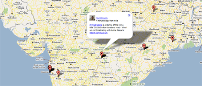
A Google Map of Indian Corruption

Corruption Tweets from India

Mibazaar tells me that corruption is rampant in India, with quite a few politicians making a fortune. He argues that social media is playing a very important part in exposing the illegal activities of some politicians.

To help publicise the work of Twitter users Mibazaar has created this Google Map of Twitter messages tagged with 'corruption'. The map animates through the latest messages posted to Twitter. The map can also be embedded in any website or blog.

________________

Monday, April 4, 2011

Americas Rock on Twitter

Twitter Top 100 Users

This Google Map of the Top 100 Twitter users (based on the number of followers) reveals that only 7 of them live outside of the Americas. Those 7, who are all based in Europe, even include Brazilian footballer Kaka and U.S. tennis player Serena Williams.

The markers on the map are colour-coded by category, for example, music, entertainment, technology etc. Like BatchGeo's Map of Top 100 Websites Worldwide the map features a really cool marker clustering system. Not only does each clustered marker show the number of markers at the location it features a nice pie chart that represents the percentage of each website category at the location.

_____________

Friday, April 1, 2011

Cricket World Cup Final on Google Maps

Cricket World Cup 2011

At the time of writing in it is just twelve hours to the Cricket World Cup final between India and Sri Lanka and the Tweets are already streaming in on this Twitter Map.

Mibazaar's Google Map shows Twitter messages posted within 1 km of the Wankhede Stadium in Mumbai. It should be really interesting to see how many Tweets are actually posted from inside the venue during the game.

________________

Wednesday, March 30, 2011

Google Maps & Twitter

Twitter Nano

Twitter Nano lets you read real-time Tweets from anywhere in the world. Using the provided Google Map you can zoom in on any location and start reading the latest Tweets posted from there.

As well as dragging and zooming the map you can also use the search box to enter a location. The Tweets for each location appear beneath the map, scrolling down with a nice transition effect.

_____________

Saturday, March 19, 2011

The Pothole Twitter Map

PG Pothole

The British may have #UKSnow but the residents of Prince George, British Columbia have PG Pothole. PG Pothole works on a similar principal to the #UKSnow map but, instead of mapping Tweets about snow, it maps massages reporting potholes.

To add a pothole to this Google Map all you need to do is add the hashtag #pgpotholes to a Tweet. If the tweet is geotagged or includes an address then it will appear on the map. The result, hopefully, will be a great guide for the drivers of Prince George as to which roads to avoid when driving across town.

________________

Wednesday, March 9, 2011

Checkin Mania's Google Maps Widget

Checkin Mania

Checkin Mania is a Google Maps mashup to track who is checking in around you using FourSquare, Gowalla, Brightkite and Twitter.

To browse a location you can use the search facility or you can just click on the map. The map will then display all the venues around you and show you who are the top users of that venue with the popular location based social media apps.

It is now possible to add a Chekin Mania map gadget to your own website or to your Google home page. You can adjust the height and width of the Checkin Mania gadget, you can also set a default location and select the services you want displayed (Foursquare, Gowalla, BrightKite or Twitter).

________________

Thursday, February 24, 2011

Mapping the Libyan Protests

Two Google Maps of the Libyan protests have been receiving a lot of press in the last few days.

Twitter user @Arasmus has put together a Google My Map called
Mapping Violence Against Pro-Democracy Protests in Libya
.


The map has been created by compiling reports from trusted accounts on Twitter. Arasmus says that each posting on the map is considered carefully before it is mapped.

Arasmus seems to be working very hard to keep the map up-to-date and has been assiduously adding the latest news to the map for over a week now.

Mibazaar's Middle East Protest Map lets you view the latest Twitter messages from the Middle East.


The map animates between the latest messages to be posted to Twitter from the Middle East. It is possible to view Tweets from the entire region or to select to view only Tweets from Bahrain, Egypt, Libya or Iran.

The Tweets are displayed at geotagged locations on the map at an interval of 5 seconds so the map provides an impressive means to view real-time updates across Libya.

________________

Saturday, February 19, 2011

Cricket World Cup on Google Maps

World Cup 2011 Twitter Map

The Cricket World Cup started in India today. Mibazaar has stepped up to the wicket and produced this World Cup Twitter map.

The map animates through the latest Tweets mentioning '#cricket'. It picks up all such Twitter messages sent from India, Pakistan, Bangladesh and Sri Lanka.

At the time of writing India are setting about Bangladesh with a vengeance and are looking to establish a huge target for Bangladesh to chase down. Judging by Mibazaar's map this is going down rather well with Twitter users in India.

_____________

Friday, February 18, 2011

Listen to Twitter on Google Maps

iHear Network

iHear Network is a free mobile application for Android that lets you visit any location in the world and hear commentary from people in those locations as they post their experiences to the web in real-time.

Using a Google Map it is possible to let iHear find your current location or search for any location in the world. Once you have set your location the application then reads out the nearest geo-tagged content from Twitter. It is possible to adjust the radius of the area you wish to hear messages from. It is also possible to select to hear "New Tweets Only".

iHear is a great idea for a geo-location Twitter application. Using the application it is possible to zoom in on locations around the world, for example try Tahrir Square today, and hear the latest real-time Tweets coming from that location.

I can't help feeling however that iHear are missing a trick by not letting you sign-in with your Twitter account. It would be nice to be able to filter out the background 'Bieber' noise and just listen to the latest Twitter messages from my Twitter friends.

_____________

Wednesday, February 16, 2011

Replay the Egyptian Protests

HyperCities Egypt

You may be getting a little bored of Twitter and Google Maps mashups that display real-time reactions to the developing political situation in Egypt but this new map from UCLA offers something new.

Like other Twitter maps HyperCities allows you to view the latest Tweets from Egypt on a Google Map. However this application also allows you to go back in time and view a stream of Twitter messages from Egypt for any day since the beginning of February. It is also possible to search the archived Tweets for any keyword.

_____________

Iran Protests on Google Maps

Twitter Dots

Twitter Dots is a nice stylised Google Map that shows Twitter messages around the world. Each day a new keyword is used to display on the map. Today the map is showing Tweets that mention 'Iran'.

The map shows the worldwide distribution of Tweets mentioning the keyword of the day. You can click on any of the Twtter Dots displayed on the map to read the Tweet displayed.

The Twitter Dots blog has also done a little analysis of some of the data produced by the maps. This analysis includes a video looking at the distribution of Tweets mentioning 'good morning' over 24 hours and another video displaying the distribution of tweets mentioning Mubarak on Feb 10th.

_____________

Tuesday, February 15, 2011

Real-Time Egyptian Tweets on Google Maps

Egypt in Tweets

This great application for viewing Tweets related to the Egyptian protests was released at the height of the crisis at the beginning of last week. Unfortunately, I spent last week incommunicado (I had a great week skiing in the French Alps, thanks for asking) so I'm posting this a little late. However now that Mubarak has resigned it is a great resource for keeping up-to-date with the emerging new political forces and new government.

The application shows geo-coded Tweets related to Egypt on a Google Map. The Tweets are colour-coded by hashtag, for example #tahrir, #cairo and #freedom. The latest Tweets are also streamed across the bottom of the map, which means you can read the latest news from the Twittersphere in real-time directly from the map.

_____________

Blog Archive

 
Best Retirement Invesments